The gg battle: 'ggplot' vs 'ggpubr', which is the better plotting package?
By Elad Oz Cohen
December 15, 2023
R is a popular statistical computing language that offers many libraries for data visualization, including “ggpubr” and “ggplot.” Both packages are designed for creating publication-quality graphics, but they have some key differences that may make one more suitable for your needs than the other.
The packages
“ggplot2” is an open-source data visualization package in R. It is based on the Grammar of Graphics and provides a layered approach to creating complex plots. ggplot is widely used for creating statistical graphics and data visualizations. It provides a high degree of flexibility in terms of plot customization.
“ggpubr” is an extension of ggplot and provides a simple API for creating publication-ready plots. It is designed to help users with common statistical visualization tasks, such as creating boxplots, histograms, and scatterplots. ggpubr has a high degree of customization and supports various plot types.
Now lets see these giantes in action, starting with the “ggplot” package:
library(ggplot2)

# Create a scatterplot with multiple layers
ggplot(mpg, aes(x = displ, y = hwy, color = class)) +
  geom_point(size = 2) +
  geom_smooth(method = "lm", se = FALSE) +
  labs(title = "Scatterplot of Displacement vs. Highway MPG by Vehicle Class",
       x = "Displacement (L)", y = "Highway MPG", color = "Vehicle Class") +
  scale_color_manual(values = c("#F8766D", "#A3A500", "#00BF7D", "#00B0F6", "#E76BF3", "#7E7E7E", "#FFC107", "#F0E442", "#999999")) +
  theme_minimal()
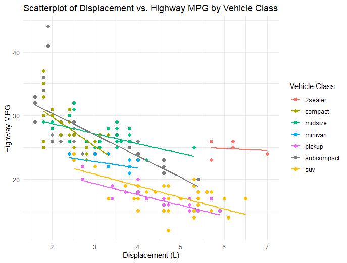
This code creates a scatter plot of the relationship between engine displacement and highway miles per gallon for a dataset called “mpg”, colored by vehicle class. The code specifies the x and y variables, adds a point layer, and adds a linear regression line with confidence intervals using geom_smooth(). The code also sets the plot title, axis labels, and color palette. Finally, the theme is set to a minimalist style using theme_minimal().
Now let’s see what “ggpubr” can do:
library(ggpubr)

# Create a grouped boxplot with annotations
ggboxplot(ToothGrowth, x = "dose", y = "len",
          color = "dose", palette = "jco",
          ylab = "Tooth Length", xlab = "Dose") +
  stat_compare_means(method = "t.test", paired = FALSE, label = "p.signif",
                     hide.ns = TRUE, label.y = 55) +
  labs(title = "Tooth Growth by Dose Level",
       subtitle = "Comparison of tooth length across three dose levels",
       caption = "Data source: ToothGrowth dataset from R") +
  theme_classic()
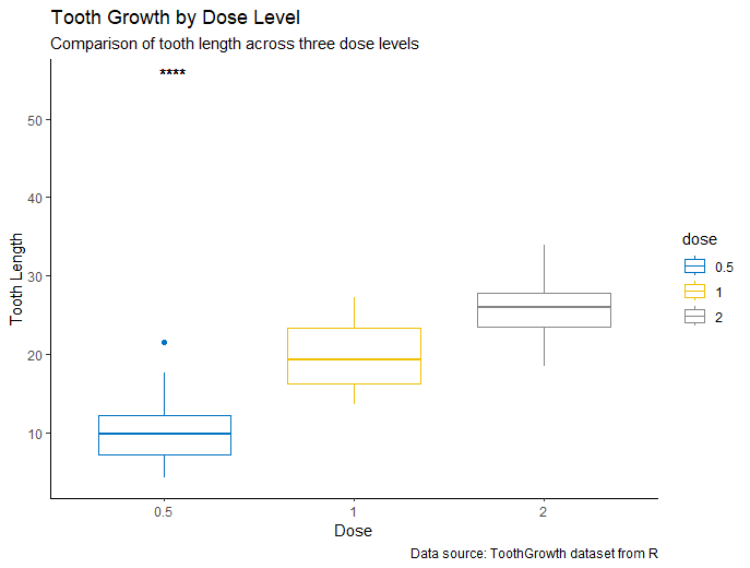
This code creates a grouped boxplot of tooth growth data, showing the relationship between tooth length and dose level. The ggboxplot function is used to create the plot, and various arguments are used to customize the appearance of the plot, such as the color palette and axis labels. Additionally, stat_compare_means() is used to perform a pairwise t-test comparison between the three dose levels and add annotations to the plot. The code also sets the plot title, subtitle, and caption, and the theme is set to a classic style using theme_classic().
These examples demonstrate the power and flexibility of ggplot and ggpubr for creating informative and visually appealing data visualizations in R. Now let us compare the pros and cones of each package.
Comparison
1) Ease of use:
ggpubr is generally easier to use than ggplot. ggpubr has a simpler API, and users can create publication-ready plots quickly. In contrast, ggplot requires users to define many components of the plot, such as the data, aesthetics, and layers. ggplot can be challenging for beginners, but it provides more flexibility in terms of customization.
2) Themes:
ggplot and ggpubr have different default themes. ggplot uses a minimalist theme, which provides a clean and modern look. ggpubr uses a classic theme, which provides a traditional and elegant look. Users can customize the themes in both packages to suit their preferences.
3) Plot types:
ggplot and ggpubr support many common plot types, such as boxplots, histograms, and scatterplots. However, ggplot provides more options for specialized plots, such as maps, heatmaps, and network graphs. ggpubr is designed to provide a simple API for common plot types.
Conclusion
ggplot and ggpubr are two popular visualization packages in R. They have different strengths and weaknesses, and users should choose the package that best suits their needs. ggplot provides more flexibility in terms of customization and supports more complex plot types. ggpubr provides a simpler API for common plot types and is easier to use for beginners. Both packages have their place in the R ecosystem and can help users create informative and aesthetically pleasing plots.
- Posted on:
- December 15, 2023
- Length:
- 4 minute read, 717 words
- See Also: